- The end
- Bunny suicides part 4
- The Complete Calvin and Hobbes
- More sketches by Predrag Ikonic aka pedja slavni !
- Calvin & Sin City
- Cool sketches
- Bunny suicides 3
- Look ahead : Supergirl #1
- Look ahead : BATMAN: JOURNEY INTO KNIGHT #1 (OF 12)
- Craig Thompson wint stripprijs 2004
WOW !

Create your own comics
Daisy Kutter
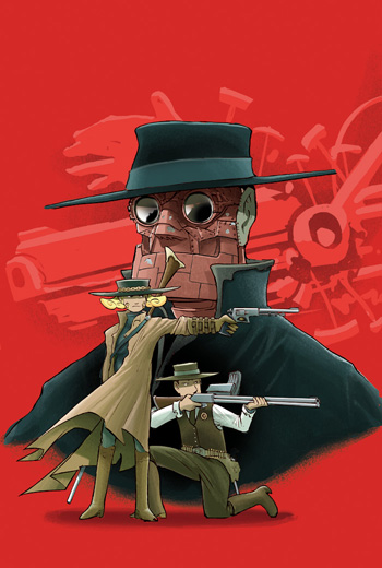
Writer & Artist: Kazu Kibuishi
Cover Art: Kazu Kibuishi
Publisher: Viper Comics
Review: This is a true genre bender, in the best sense of the word, and as such it’s difficult to describe it correctly. It did remind me of Cowboy Bebop, in that when you describe its separate elements, it sounds a bit tepid, and odd, but when you actually see it for yourself, you realize it’s more than the sum of its parts. Certainly I felt lukewarm about this series when I first heard about it, but it turned out to be one of the best thing Viper has ever done. (I also avoided Cowboy Bebop as just another anime series too, then I saw it one night, and was instantly hooked. So that goes to show you how knee jerk reactions aren’t always the correct ones. Well, at least on my part at any rate.)
First off, Daisy is a very sympathetic character, although basically an anti-hero; to paraphrase our own Matt DeWoskin,“ a good person who sometimes does bad things“ . Although a “retired” gunslinger, it’s clear right away that she isn’t really all that happy with her “new” life; she’s restless and edgy, and her ex-boyfriend/partner, Tom, sold out in a big way by becoming Sheriff of the town they reside in. He wants her to join him in the marshalling, but she refuses, even though it’s clear there’s still mutually unresolved feelings between them. (Although it seems like Daisy is the one who wants to keep her distance; Tom lets it be known he’d like her back, in no uncertain terms.) After a risky bet doesn’t pay off and she loses her store to mysterious, wealthy Mr. Winters, he offers her a deal: her store back, and money on top of it, if she agrees to rob a train with two of his associates, Morris and Bloom - one of which is a robot, a bit of a problem as she’s not crazy about working with machines. Still, she’s desperate, and the job looks dead easy, especially for her. But of course something goes wrong, as it seems like Winters actually had other plans for her that he didn’t bother to disclose to anyone, and he has no intention of letting anyone make it out alive.
Although the story does start off at a somewhat slow pace, with an odd aside on how to play Texas Hold ‘Em, the story soon ratchets up the action, with the last “chapters” being almost solely devoted to action. But even with all this action - including the truly spectacular train sequence - there’s a surprising amount of character development, especially in the relationship between Daisy and Tom. She clearly has some affection for him, but what’s also clear - without a lot of mush or treacle - is how much Tom still loves Daisy. He loves her enough to look the other way in her sometimes shady dealings, to be concerned about her welfare, to risk his career and his life to try and help her, even when she steps over the line. Romance is just another genre melded into this series, but so deftly and delicately that you don’t even realize it at first. This manages to be fun, thrilling, dark, and sweet in a way that many comics strive to be, but simply can’t reach. Kibushi has quietly crafted a small masterpiece, a truly original comic with a style and a “voice” all its own.
Certainly his art, full of clear, clear lines, is a major factor in this. At times it has a bit of a cartoonish, manga look, but that works in the context of this series, and it helps make the action sequences very kinetic and slick. His art style also makes the robots seem like a perfect fit in the dusty desert world of Daisy Kutter, even when in contrast to the rustic, retro wooden buildings that make up most of the towns. He also has a tendency to select very cinematic panels, so the sequences move very quickly; sometimes it’s more like a portable film in print form than a graphic novel.
This trade is also manga sized, which means smaller in height, but more portable, and satisfyingly thick and weighty, especially for the price. It also has a small but nice collection of extras, from concept sketches to a pin up gallery by a wide variety of artists.
If you like well written, artful, thoughtful comics that aren‘t just concerned with superheroes or set in rigid genres, you owe it to yourself to check out Daisy Kutter: The Last Train. And I certainly hope that the number one on the spine indicates that there’s more Daisy to come, because I for one would love to see that.
1:14 PM
![]()
![]()
Too much coffee man
I like this comic , so I thought why not share it with you guys and girls.


9:08 PM
![]()
![]()
A Comparative Study of Different Comics Formats
The comic strip today is very diverse. Comics do not only vary in style and content, but also in means of production and consumption. A lot of these differences are local. One can see some important differences between the Japanese manga, the European production and American comics. But even within each territory, comics do not form a homogeneous group. Think for example of the differences in the USA between comic strips, comic books, non-mainstream comics and small press comics. All these comics can be further classified in different genres and sub-genres. Readers usually confine themselves to one or just a few genres.
Even the most idiosyncratic authors such as the Frenchman Edmond Baudoin take into consideration the format in which they will be published. The first ten years of his career he worked for the standard black and white European album of 48 pages (of which 44 or 46 are used for the comic itself). When Baudoin later reworked the idea of one of his European albums, Le premier voyage (see illustration 2) for a mangamagazine (see illustration 3) for the Japanese publisher Kodansha, he not only exceeded the usual 46-page limit, but he also changed his way of telling stories. The smaller format changed his lay-out. Because he could use more pages to tell his story, his style became far more visual, with lesser text than his European comics. It was the first time he made a story of more than 46 pages. Le voyage had five times more pages (221 plates) than Le premier voyage. Baudoin told me that he also adopted another drawing technique. Namely, he drew much faster than usual. When Baudoin drew Made in U.S. or Nam (see illustration 4) for the extremely small format (7,5 * 10,5 cm) of 'Patte de Mouche' of L'Association, he put his pencil aside and drew with a pen. The thinner lines are clearly better suited for such a small format. Obviously format has a big influence on Baudoin, but at the same time, all these comics are still typically Baudoin. It is not because an artist adopts himself to a format that he loses his identity.
Since the eighties, some of the most successful comics were later republished in the pocket format. In most cases, it was impossible to reduce a complete page, because a lot of details would be lost and the drawings would become too small for the reader. Therefore, the comics were adapted. The original page lay-out was given up and replaced by another division in rows. To do this the initial panel dimensions had to be adapted and sometimes even the composition of the drawings had to be changed. A significant example is a tennis gag of the Idées Noires series by Franquin (see illustration 5). The original plate is cleverly composed so that one player is always standing on the left end of a tier, facing the right and his opponent, standing at the other side of the tier. They hit the ball to each other. The reader gets the impression that the ball flies across the space of the plate itself from left to right and back. This effect is lost in the pocket version, where the players no longer physically face each other on the same row. The dimensions of the panels are also adapted to fit the new lay out. Although the author himself was responsible for this adaption, the pocket version is less compact and less refined than the initial publication.
An author who works for French language publishers such as Dupuis, Dargaud or Le Lombard is expected to develop a series around some central characters. He knows that his stories will have to be exactly 46 pages long, which is, as several artists and critics have already complained, too short to develop a novel-like complexity.
It is exceptional that an author gets the opportunity to make a one-shot story and to exceed the page limit. For this purpose, publishers created special series comprised of several non-related albums.
So, the format will eventually influence the total concept of the comic, not only the style, but also the content. The material aspects of the format will determine the page lay-out, the choice between monochrome or colour, the kind of story, the way in which it will be told, etc. The format's advantages and disadvantages are known by the readers. When someone buys or reads a certain comic, he can detect from the format - even without knowing the characters or the author - what he can expect from that particular comic. Different formats even stimulate different manners of consuming: a manga magazine is quickly read and thrown away after reading, while a European album will be kept and read several times.
A format is not only defined by its materiality (the size, the paper quality, etc.) but also by its temporal aspects (does it have a temporal regularity or is it published only once at a precise time?) and editorial choices (how long can a chapter or a story be, what are the taboos?).
It is therefore necessary to take the format into account when one judges a work. As obvious as it may sound, this fundamental aspect is often neglected in comics criticism. Of course the format will not and cannot explain every aspect or detail of the comic concerned, but at a fundamental level it is responsible for major characteristics. Stop comics are especially made for newspapers, in which they can be enjoyable. This is not always the case for reprints in book form. Reading one hundred gags of the same series one after another can become a repetitive and dull activity. Although American newspaper comic strips are printed daily in hundreds or even thousands of newspapers, they rarely succeed on the international market in book form. The reverse can also be true: comics that are made for albums are seldom enjoyable as a comic strip in a newspaper. Reading even a page a day of a Cosey or Baudoin comic would be futile, because the pages should be read in their context. A newspaper reader would get the impression that nothing happens when reading only one page.
Both material limitations and editorial choices have their impact. Each sort of publication has its potential and limitations, and therefore incites artists to use the resources offered. But an artist will not necessarily use every potential the format offers. Sometimes artists need time to understand the potential of a medium. For example, the earliest comic book authors ignored the potentials of the medium. They imitated the page composition in regular tiers of the comic strip (uniform grids of equal-sized panels). Comics critic and artist, Robert C. Harvey deplores the fact that they ignored the spacious page format which would have allowed them to vary the size - both height and width - panels for emphasis. Once Kirby and Eisner started using the space in a more baroque way, their approach became fashionable among comic book artists.
Culture, tradition, ideology, personal qualities, etc., will all influence the choice of resources artists will make. Nevertheless, each analysis of comics has to start with a study of the form it is being published in. That is the reason why this paper is called: The Importance of Being 'Published', rephrasing a book title by Oscar Wilde, without any further connotations.
This is a first attempt towards a comparative study of the comic format and its influence, hoping that others will refine and correct my observations, since it is impossible to be an expert in every possible format. The worldwide comics production is far too vast for one person to have a much less complete knowledge of it.
- The comic strip in the newspaper
- The comic book series
- The manga magazine
- The European album series
- The one shot
- Small Press
In Belgium, the Flemish newspapers started publishing more comics by local artists after the Second World War. These artists worked for only one (group of) newspaper(s). So until some years ago, the deadline was very short. Some cartoonists such as Marc Sleen worked in the newspaper's offices for years. Marc Sleen was credited by the Guinness Book of Records in 1989 for the making the longest running comic strip by only one author, without the help of assistants. In Flemish, the comic strip is called Nero, in which the main character was named after the crazy Roman emperor.
The adventures of Nero are a unique mix of foolish humour, adventure, wild imagination and criticism of hot topics. For years the stories of Nero started running in the newspaper before the script was finished. Sometimes Sleen worked only a few days in advance of the publication. During the publication in the dailies, Sleen drew out his story and let himself be inspired by the events of the day. Sleen's writing adapted itself to the calendar. The external time (the dates of the publication in the newspaper) influenced the internal time of the story. Special holidays and other important dates in Belgium such as the sixth of December (Sinterklaas), New Year's Day, Christmas, Easter, All 'Fools' Day, Labour Day and the reopening of the schools (beginning of September) could be incorporated in the comic. Those allusions to the external time could even bring a pause in the story (characters stop their action to wish the reader a happy new year) or change the course of the story: in one story (De Wortelschieters), the necessary antidote can be found in the Easter eggs falling from the sky, in another, the mule of 'Sinterklaas' saves the heroes (De juwelen van Gaga-Pan ).
But Sleen went further than just alluding to important dates. He also referred to and even criticized the events of the day, both in Belgium and abroad. He took a stand in great Belgian conflicts such as the Royal Affair (which brought Belgium to the brink of civil war), or in international problems (such as the Cold War). The elasticity of his storyline and his working-method consistently made it possible to incorporate, even during the publication of the comic in the newspaper, new events and to change the course of the story. For example, in De IJzeren Kolonel (The Iron Colonel) from 1956, an English colonel asks Nero's help in regaining the Suez-canal, maintaining that his great-grandfather bought the canal. This theme is clearly inspired by the nationalization of the Suez-canal by Egyptian president Nasser. When the publication in the newspaper started, war was imminent but it would take until the end of October before British and French airplanes would begin bombing Egypt. Even before the outbreak of the war, Nero and the Iron colonel disembarked on the Egypt shore, where they are taken for foreign invaders. The Suez-crisis is not the only hot issue that Sleen incorporated in this story. When by the end of October Russian troops crushed the Hungarian protest, Sleen let two other characters pass through that country. This was not planned in advance, because some days before the Russian tanks attacked, the two characters were already speaking about their trip to Egypt. On the 18th of October, they said that they would travel via Germany, Austria, Bulgaria, Turkey, Syria, Lebanon, Israel. At that point, they did not even mention Hungary, since the crisis only began a few days later. When Soviet tanks began to crush the Hungarian rebellion on the 27th of October, the author quickly changed the script and inserted a scene where the two youngsters are cruising through Hungary. On Thursday the 8th of November, they confront a Russian tank (see illustration 6). But when one of the young friends of Nero, Petoetje talks about two Belgian ministers (Van Acker and Spaak) who visited the Soviet Union some days earlier and mentions their cultural agreement, the Russian soldiers run to them with open arms. However, the two Flemish kids knock them out and drive off with the Russian tank. They continue their voyage to Egypt, where the Suez-crisis is reaching its peak...
The Flemish comic strip can reflect on hot new items as fast as the (editorial) cartoon.
The incorporation of the dates of external time also has other consequences. Most comics try to form a consistent world of their own, with a logical internal timeline. In Nero, the proper internal time is often neglected by the characters themselves: they sometimes speak in terms of external time, which does not always parallel the internal time.
When Nero's wife says that her husband was absent for 5 or 7 months, she does not mean the time he was away in the story (internal time), but the period of the publication in the newspaper (external 'real' time). Sleen more than once played with those tensions between the external and internal time. From this viewpoint, it is a pity that this Flemish author no longer continues with such 'time play'. This linking of internal time and external time loses its importance in the later book publication. Moreover, it can even become confusing. Comics of this sort have to be read in their context in the original format, if all of the allusions and references are to be understood.
Although my observations may sound a little crude and unrefined, the point was made clear that when we want to study a comic, we should always consider thoroughly the format the comic was made for. Hopefully, this clarifies the importance of being published.
5:19 PM
![]()
![]()
Weekly comics

7:48 PM
![]()
![]()
MADE IN BELGIUM : 175 jaar BELGIE !!
Ik ga me vooral concentreren op de strips en stripauteurs ;-) !
Naar aanleiding van 175 jaar Belgie loopt er in Brussel een tentoonstelling over België
en uiteraard ook over de Belgishe stripauteurs ! Men kan originele tekening van o.a Willy Vandersteen, Edgar P. Jacobs en Marc Sleen zien...
WAAR EN WANNEER ?
De tentoonstelling gaat begin 2005 van start. In Brussel, hoofdstad van het federale België en vestigingsplaats van tal van Europese instellingen. Plaats van afspraak : de Schildknaapstraat, 50, 1000 Brussels, vlakbij de Grote Markt, de mooiste ter wereld, symbool van onze hoofdstad en regelmatig het decor voor de feestelijke ontvangst van een zoveelste Belgische held(in)... Het verjaardagsprogramma omvat al een hele rist manifestaties. De tentoonstelling MADE IN BELGIUM vormt de kers op de nationale taart.
STRIPVERHAAL
Kuifje vind je overal ter wereld en in alle talen. Robbedoes, Suske en Wiske, Lucky Luke, de Marsipulami, de Smurfen en tal van andere striphelden getuigen van de enorme, universele mogelijkheden van dit steeds actuele medium. Een kweekschool van talent met zoveel personages dat zij een telefoongids kunnen vullen.
De bezoeker kan de verschillende objecten ontdekken die te maken hebben met het stripverhaal. De bekendste striptekenaars tekenen elk letterlijk voor reuzenomslagen : Hergé, Jacobs, Franquin, Martin, Jigé, Vandersteen, Peyo, Morris en Marc Sleen,...
Klik op de vlag !

6:39 PM
![]()
![]()
Books : learning how to draw !!
These are the books that I use to learn how to draw , I just bought those and I must say they are simply amazing ! They are very good written , the art is very illustrating and learns you the basic technique that you need/must know in order to draw comics pages . Trust me , if you ever bump into those books buy them you won't be disappointed ! Here they are...

HOW TO DRAW MANGA--GETTING STARTED
This is by far the very best "How to Draw Manga" volume for novice and intermediate illustrators. The book is divided into five sections featuring dozens of pointers:
- The Basics: Understanding and choosing pens, pen tips and manga paper
- So You Wanna Draw Characters: Expert advice for immediate results
- Setting the Proper Tone: Knowing how and when to use manga tones
- The Art of Storytelling: Making your illustrations come to life
- Beautiful Backgrounds: Setting the right scene and understanding perspective
Every page is loaded with illustrations drawn by the experts at K's Art, the group that has produced several volumes in the "How to Draw Manga" series. This is an essential reference book that you'll find yourself turning to again and again for years to come.
ENGLISH LANGUAGE. 126 pages. Black-and-white with color jacket. 10 inches long by 7 inches wide.

From head to toe, the human form, in all its complexities, is visually simplified to such a degree in this remarkable workbook that even complete beginners will soon be able to draw accurate, well-proportioned faces and figures every time they try.
Avoiding complex charts of muscles and bones that are more helpful to doctors than to artists, this book’s refreshing approach teaches anatomy from a cartoonist/illustrator’s point of view. For example, there are many large and small muscles in the neck, all rendered in great detail in most anatomy books, but here, master teacher Christopher Hart shows only the four that are visible and need to be drawn. His clear instruction helps readers to visualize and portray shifting body weight in a pose without the need of a model, and instead of showing a mass of facial muscles and bones, he translates them into the simple planes an artist needs to draw a range of expressive faces.

11:34 AM
![]()
![]()
Underground comix and the underground press
| ||||
  | ||||
The late 1960s saw the emergence of underground comics, a new wave of humorous, hippie-inspired comic books that dealt with social and political subjects like sex, drugs, rock music and anti-war protest. For this reason, these new comics became known as "comix" to set them apart from mainstream comics and to emphasize the "x" for x-rated. | ||||
 Fat Freddy as Santa Claus, by Gilbert Shelton in The East Village Other, 1970 | ||||
Comix originated from a variety of sources, which can be traced back to the 1950s. First, there was the influence of the Mad tradition. Harvey Kurtzman had liberated comedy in comics and inspired a new generation of cartoonists to push the boundaries of satire even further. More directly, in his post-Mad magazine, Help!, Kurtzman provided pages devoted to "amateur talent," where many future undergrounders, like Robert Crumb and Gilbert Shelton, got their first break. Also, underground newspapers such as The East Village Other (which featured articles, music reviews and hippie news), started to publish comix and attracted work by artists such as Vaughn Bodé, Spain Rodriguez and Willy Murphy. As these comix gained popularity, The East Village Other started its own monthly comix magazine, Gothic Blimp Works. | ||||
| ||||
A major underground influence was the anti-censorship reaction to the imposed 'comics code'. In the 1950s, there had been a crusade against comics (especially those published by E.C. Comics), which had inspired the passing of the Comics Code, a set of rules to which comics creators had to adhere. As children, the future underground artists were the very people who had been worst hit - they watched their parents tear up their comics collections, or throw them on the playground fires. Now it was time for payback. | ||||
 | ||||
The most outspoken production against the Comic Code was the defiant series Doctor Wirtham's Comix & Stories, which appeared around 1977. The colophon read: "We publish good art and underground stories in the E.C. vein, the kind of stuff you know the good doctor would love to hate," which referred to Dr. Fredric Wertham, the man who wrote "Seduction of the Innocent," the book that was responsible for causing the ban on comics in the 1950s by alledging that comic books were corrupting kids. Some of the artists who contributed their work to this series were Doug Potter, Mike Roberts, Al Davoren, Ripp, Greg Irons and Hector Tellez. | ||||
| ||||
The underground movement was an expression of its time. In the latter half of the 1960s the hippie movement in America was engaged, to a greater or lesser extent, with protests against the Vietnam War, the civil rights struggle, anarchism, Women's Lib and Gay Liberation. Add to this an interest in the spiritual value of taking drugs and of "free love" and you had, very simplistically speaking, a thriving "counterculture" against traditional values. | ||||
| ||||
 | ||||
San Francisco and the New York area weren't the only places that produced underground comix. Many people featured their comic art in self-published fanzines from all over the United States. One hot spot in the underground comix scene was the Armadillo World Headquarters in Austin, Texas, which was basically a pub with a music hall that attracted many artists, and resulted in publications like 'Armadillo Comix' and 'Austin Stone'. Some of the artists that were a part of this scene were Jim Franklin, Guy Juke, Karl Dolgener, Dennis Harper, Kerry Awn, Micael Priest and Danny Garrett. | ||||
 "Armadillo All-Star Art Squad" Illustration by Micael Priest in Austin Stone, 1976. From left: Danny Garrett, Sam Yeates, Jim Franklin, Ken Featherston, Henry Gonzales, Micael Priest, Kerry Awn, Guy Juke and Gary McIlhenny. | ||||
Without the financial, strategic and moral support from the publishers and comic stores behind the scene, the comix couldn't have survived. Print Mint, Last Gasp, S.F. Comic Book Company, Kitchen Sink, Apex Novelties, Comics & Comix stores and others were the vital links to keeping the comix alive and flourishing. They faced the financial risk of the books being commercial flops or even worse, being arrested for promulgating literature considered "obscene according to the standards of the local community." | ||||
| ||||
In April 1968, Gary Arlington (1938 - ?) opened the San Francisco Comic Book Company, one of the very first 'comics only' book stores, in the city's Mission district. As guru and 'godfather' of underground comics, he encouraged and directed many artists on their path to publication. His tiny 200-square-foot store became the underground nexus where artists met, discussed projects and exchanged ideas. He also published several series of early comix, namely Skull Comics, Slow Death Comics and, of course, San Francisco Comic Book (issue no. 1 of this series is very rare and has become much sought after by comix collectors). | ||||
  | ||||
By the end of the 1960s, women comic artists united and founded their own comix, such as Wimmen's Comix, Tits 'n Clits and Twisted Sisters. After 1975, a second wave of underground comix came up, with more punk inspired comix such as Anarchy Comics, founded by Jay Kinney. | ||||
| ||||


11:20 AM
![]()
![]()
Many faces of Batman

24 the comic by CASTERMAN
It goes both way I guess , not only movies are made from comics but also comics are made from TV series ,hence 24 . It looks awful , jesus christ I hate the drawings so much and the color is terrible. A huge crap overall...


Here is the synopsis in French. The price is 10 euro.
Action ! L'agent Jack Bauer et ses collègues du service anti-terroriste héritent d'une encombrante mission : protéger une dangereuse et très séduisante terroriste, Moira O'Neals, de la vindicte de ses anciens frères d'armes. Or Bauer vient d'apprendre, lorsque cette histoire commence, qu'un certain McGinnis vient de franchir clandestinement la frontière mexicaine. L'homme est l'une des plus fines gâchettes de l'Ira, l'organisation terroriste irlandaise, et il y a fort à parier que la protégée de Bauer est sa cible désignée. Débute alors un haletant suspense, sous la menace d'un adversaire d'autant plus inquiétant qu'il reste parfaitement invisible. Chaque double page du récit est rythmée par le décompte du temps qui passe, sous forme d'affichage digital. L'ensemble de l'histoire est menée sur une journée complète - 24 heures,ainsi que le veut le concept qui donne son titre à la série télévisée -, à raison d'une double page par heure.
12:00 PM
![]()
![]()
The Girl from Ipanema by Hermann & Yves H.
PREVIEW : Coming out in 2005 !


7:36 PM
![]()
![]()
Robot comix

Tekstovi iz novina o Bone,Ken Parker,stripovima...
Hvala zvelesu na scanu :-) !
BONE
Hvala Melini na scanu :-) !
Tekst o Ken Parkeru
Tekst o stripovima
Hvala zoki jos jednom :-)) !
Tekst o Emir Mesicu
2:40 PM
![]()
![]()
WEEKLY COMICS


6:04 PM
![]()
![]()
Invincible Hard Cover !!
Following the announcement earlier this week of Robert Kirkman's Invincible being optioned by Paramount Pictures, Image Comics on Friday announced a hardcover collection that will be released on June 8.
Invincible: The Ultimate Collection, Vol. 1 will collect the first 13 issues, clocking in at 400 pages for $34.95. The issues collected feature artwork from series co-creator Cory Walker and current Invincible artist Ryan Ottley, and will contain bonus material and an introduction by Brian Michael Bendis.
The hardcover will follow April's Invincible #0, a 16-page, 50-cent comic that serves as a jumping on point, including the origin of the character.
Kirkman himself is writing the film, which will be produced by Lorenzo Di Bonaventura.
"I had so much fun writing it the first time around that I can't wait to write it all again in a new medium," Kirkman said.
Kirkman said he's hoping the spotlight on the book will convince anyone who might not be reading Invincible to give it a shot.
"Readership on Invincible continues to grow month after month," he said. "Hopefully with this announcement people who had been reluctant to give a new superhero book a try will now give Invincible the chance it deserves. In preparation for that we're trying to make it as easy as possible with a reasonably priced hardcover and the 50-cent zero issue."
This is the cover for the HC volume !! Looking good baby :-))!

1:28 PM
![]()
![]()
Lineage
NEW COMIC, Lineage, coming out in May from Approbation Comics as part of Myriad (an anthology book)...
Check out the writer's site too !

6:49 PM
![]()
![]()
Ekstra Gedza
Samo ime je provala :-)) ...
Tajna Ekstra Gedžinih moći...
Milisav Lukić je bio samo prosečan mladić koji je tek napunio trideset i jednu godinu kada ga je njegov deda Budimir, u selu poznatiji kao Kobac, pozvao da mu saopšti veliku porodičnu tajnu koju su prenosili sa dva kolena na dva kolena (s dede na unuka) svi njegovi preci. Ta tajna sadržana je u hrastovom buretu koje je skriveno u mračnoj pećini skrivenoj od tuđih pogleda. U tom hrastovom buretu se nalazila magična tekućina u narodu poznatija kao džibra koju je Velizar Čudotvorac, u Moravskom kraju kasnije kanonizovan kao Sv. Velizar Šljokča, zaštitnik proizvođača alkoholnih napitaka, spravio specijalno za kneza Lazara, a koju je ovaj poklonio Milisavljevom pretku za izuzetne zasluge u borbi protiv Turaka. Tada je Milisav shvatio da kada popije gutljaj te rakijice, dešava se čudesna transformacija. Milisav postaje Extra Gedža, superheroj bez mane i straha, najjači kad se napije, u stanju da isprazni i najdublje bure, nadčovek sa najotpornijom jetrom na svetu, čija magična harmonika ispušta najumilnije zvuke Slinanovih i Šabanovih pesama od kojih strepe negativci diljem zemaljske kugle.

11:15 AM
![]()
![]()
'When I was four, I knew I was weird'

Top 10 in 2004 : België !
1. Over de Grenzen van de Tijd... 1+2
2. Een Deken van Sneeuw
3. De Klaagzang van de Verloren Gewesten 5
4. De Wraak van Graaf Skarbek 1
5. Legende 1+2
6. Thorgal 28
7. Muchacho 1
8. Persepolis 4
9. De Schorpioen 4+5
10. De Val
7:36 PM
![]()
![]()
My life is a comic book (story) : cool blog !
Real nice blog , it's in french but trust me art is an universal language ;-)) !!!
Check out the links on this blog , some are very cool !
http://ma-vie-est-une-bande-dessinee.blogspot.com
5:27 PM
![]()
![]()
My very first drawing
Drawing of Magico Vento , an Italian comic published by Bonelli.
It's my first drawing ever !


3:46 PM
![]()
![]()
XIII coming to America

In Europe he needs no introduction and specially not here in
Good news for you , XIII is very cool comic and soon it will be published by Alias .
That's all the good news :-)) now the bad news , Alias will throw out all the nude scenes (I guess censorship is allowed in the states :-)) ) , also they'll chop the comic in half and reduce it to the well known "comic format" . Here in Europe , XIII is published on A4 format and has 48 pages btw ... Alias hopes to publish all XIII comics in 3 years time so that they get synchronised with the Europeans (the last issue over here is 16, the comic comes out every year or every 2 years in Europe ) .
Alias will use original European covers as well as unused i.e. unpublished covers and covers specially made for the
European publisher is Dargaud . The writer of XIII is Van Hamme and the artist is Vance . There are already english versions of XIII available , published by Catalan Comics in early '90's but I guess they weren't that big of success.
12:33 PM
![]()
![]()
Guess what , a new comics movie !
Paramount Pictures has bought the rights to Robert Kirkman's teen-superhero comic "Invincible."
The story is based on the Image Comics series about the coming of age of teen Mark Grayson, son of the world's most powerful superhero Omniman. The film will focus on the father/son dynamic during the time that the son, who appears to be a normal teen, begins to exhibit his father's powers.
This film also marks Kirman's first screenplay as he recently signed an overall deal with Marvel…
Read first issue of Invincible online
12:20 PM
![]()
![]()
Elektra drawing

Daily comics
I'll try to post comics and gags every week on the blog !!!
I'll also try to draw some comics , when they're done I will upload and put 'em on the blog...


1:27 PM
![]()
![]()